One common issue I see people do is fill up the space with the visual that they are using. However this can lead to a problem and distort the information that you are trying to show.
In this example, your report developer has stretched the visual to a nice wide chart, fill the width of the reporting area:
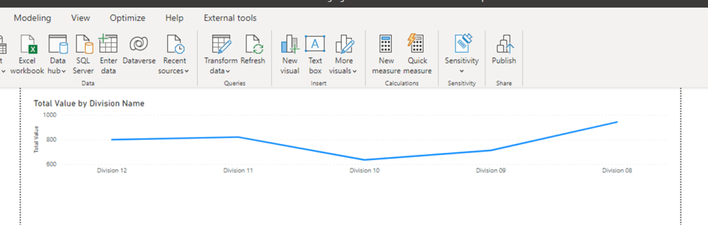
This has the unintended effect of stretching out the line chart, flatting the variation between the values. I makes the viewer think that there isn’t that much difference in the values. Lets try making it a bit smaller.
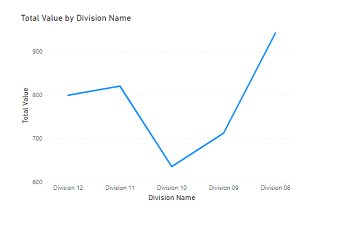
Now it has been scaled down a bit, it is now showing the variance in a more intuitive way. Don’t feel the need to fill in all the blank space in the report surface area. Think about what you want to show (as always in visuals), in this case the variance, and remember that size can distort the shape of what you are trying to show.
