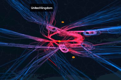
“Have you seen the deck.gl framework from Uber? It’s designed to show large scale big data visualization?” said one of the software engineering team. I had a look at it, and it does look amazing. The below image is from the deck.gl framework, and shows car accidents across the UK, or at least in the screen grab, the south east and London.

We went through some of the examples, and while looking at the flight data one, they mentioned that ‘You can’t do that in Power BI’.
I retorted, ‘You can do something a bit similar’ I then had to go prove I could do it. To be fair they had said that a few times while going through the examples, I had to pick one I knew I could do. There was no way you let the front end peeps lord it over us data geeks, what sort of a world would that be!
So first of all, I had to get some data. Thankfully the lovely people at Uber data visualisation, had provided the source of the data. One quick hyperlink later and I was downloading flight path data from the website The OpenSky Network. It’s a service that collects data from a network of stations that read the ADS-B and MODE-S signals transmitted from the aircraft for air traffic control.
It’s a big data set, it is split by day, and then by hour, and as it can be downloaded in CSV format, so I loaded the one file for the 07:00 to 07:59 data, that was about 200 mb.
Nice and easy so far, its a very easy formatted data set (check the readme.txt on the site), apart from the time columns. They are in the Unix format. For those not familiar with it, it is not a date time, it is the number of seconds that have passed since 01/01/1970. So 1574349827 is 11/21/2019 @ 3:23pm (UTC). That isn’t an issue with a bit of M we can convert it on load in Power BI to a nicely formatted date time format.
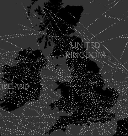
#datetime(1970, 1, 1, 0, 0, 0) + #duration(0, 0, 0, [time])Once that was done, I mapped the points on the map visual which gave me the following output:
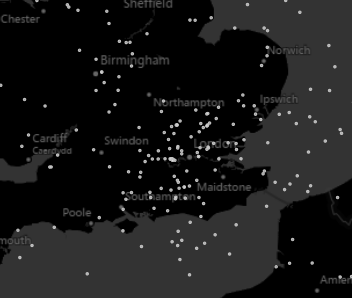
One problem, there was to many points, so I’ve filtered the data on the Latitude and Longitude columns just to show a range for the UK. Looks good, but we need to animate it. Does Power BI do animation? No… well not by default, but there is a custom visual called Play Axis that can enable you to do it.

This allows you to add a column to it and play it in order, in this case my date time. In fact I didn’t need to convert the Unix time, as it would have played it back in numerical order! Once that was added to the report we have animated visual awesomeness!
I’ve loaded the sample file on my GitHub here enjoy!
