For a recent project, I’ve had to hit the R scripting and use the R Visuals to plug a gap in Power BI (PBI). Even though PBI is very capable, it does not have the full range of statistical formulas that Excel has. So I’ve had to build Linear Regression formulas in DAX, and also calculate in Power Query some coefficients using R. For the visuals, again I hit some limits with Power BI. I needed to use a measure as an axis, I also needed to show a polynomial trend line, so had to use the R visual and the ggplot2 library to display the data.
I’ve not used R much, I’ve been on a SQL Bits training day about it, and one of my colleagues, was quite good at it (However they have since moved on), so it was a nice move out of my comfort zone and I get to learn something too!
Note: If you want to follow this blog post you’ll need Microsoft R Open and install the ggplot2 library. Also useful is the ggplot2 reference web site.
In this example I’ve started with a blank PBI file, and used the ‘Enter Data’ function to create a column with single value in it. You don’t need to do this if you are using you own data, I just need something to drag into the R visual to use as a data set. I’ll actually be using one of the inbuilt R data sets for the visual. You can download the example PBI file from my GitHub
So lets start with the basic set up in the R Visual.
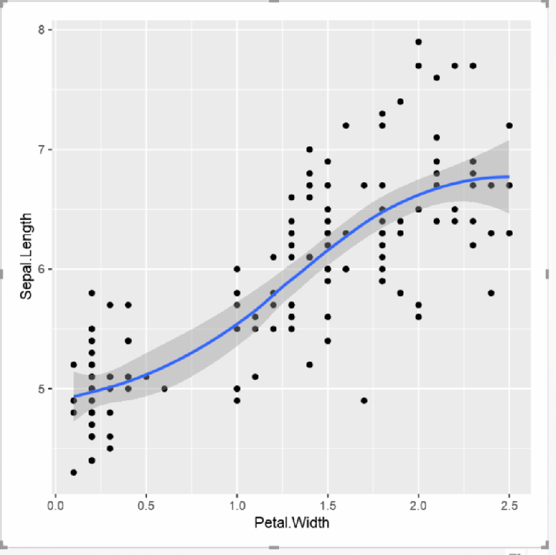
library(ggplot2)

#Base Chart uses the iris dataset
chart <-    ggplot(iris, aes(x = Petal.Width, y = Sepal.Length)) +
            geom_point() +
            stat_smooth()

#display
chart
Which renders the following chart. (Note the rounded corners in the visual, thanks to the Feb PBI Desktop update)
Lets break this down. First it calls ggplot, using the ‘iris’ data set and assigns the Petal.Width and Sepal.Length to the relevant axis.
ggplot(iris, aes(x = Petal.Width, y = Sepal.Length))
Plots the points on the chart, don’t miss this bit out, I did, and could not understand why I wasn’t seeing any data
geom_point()
Add the trend line and the shading.
stat_smooth()
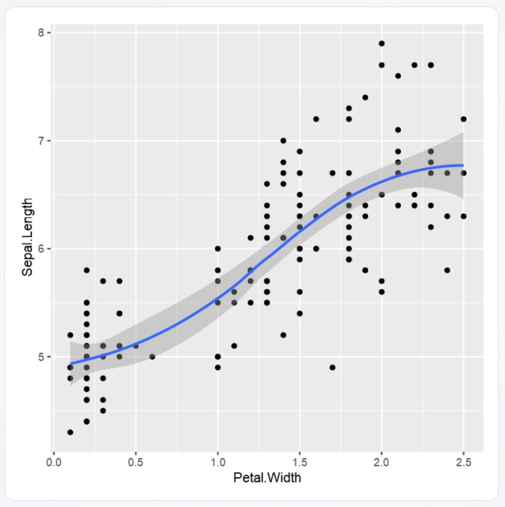
So far so good. But it does not fit the Power BI style, and will look a bit out of place along side the base PBI ones. However we can fix that. First we are going to add two variables called BaseColour and LightGrey and assign them a hex colour value so they can be used without having to recall the hex values. So the base code will look like:
library(ggplot2)
#BaseGrey
BaseColour = "#777777"
LightGrey = "#01B8AA"
#Base Chart
chart <- ggplot(iris, aes(x = Petal.Width, y = Sepal.Length)) +
geom_point() +
stat_smooth()
#display
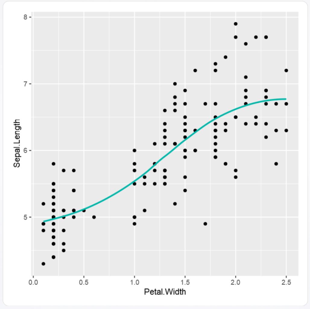
chartNothing should change in the visual. So next I’m going to update the stat_smooth function, to remove the shaded area and change the colour of the line.
stat_smooth(col = LightGrey, se=FALSE)
‘col’ assigns the colour, ‘se’ removes the shaded area.
For the next set of updates to the visual, we are going to update the theme setting, specifically the following:
- Axis Text
- Axis Ticks
- Panel Grid
- Panel Background
So lets start with the text. if you poke around the PBI formatting settings you’ll come across the default font family, size and colour in the standard PBI visuals. So next we are going to add the following:
First set the ‘axis.text’ elements to the size, font and use the variable ‘BaseColour’
axis.text = element_text(size=11, family=”Segoe UI”, colour=BaseColour)
remove the axis ticks with
axis.ticks = element_blank()
and set the axis text, setting the colour using the BaseColour variable
axis.title = element_text(size=11, family=”Segoe UI”, colour=BaseColour)
but will need to wrap it up in the ‘theme’ stuff, so the code now looks like:
library(ggplot2)

#BaseGrey
BaseColour = "#777777"
LightGrey = "#01B8AA"

chart <-    ggplot(iris, aes(x = Petal.Width, y = Sepal.Length)) +
            geom_point() +
            stat_smooth(col = LightGrey, se=FALSE)

#Build theme
chart <- chart + theme(      axis.text = element_text(size=11, family="Segoe UI", colour=BaseColour)
                         ,   axis.ticks = element_blank()
                         ,   axis.title = element_text(size=11, family="Segoe UI", colour=BaseColour)
                        )

#display
chart
Which hopefully should be getting close to the PBI look:

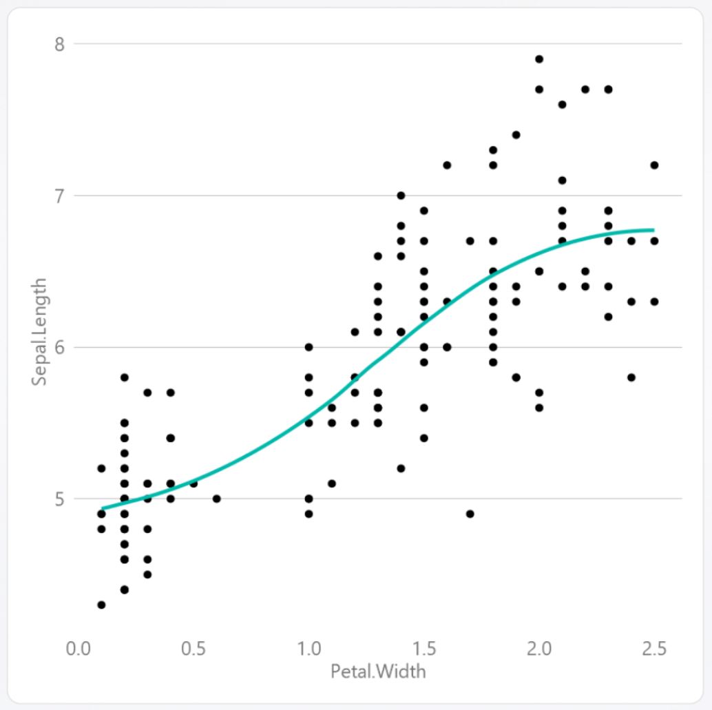
So just the grid line and backdrop to sort out, which will be added to the theme set up as:
Set the grid for the ‘y’ axis.
panel.grid.major.y = element_line( size=.1, color=BaseColour )
Set the grid for the ‘x’ axis, basically get rid of it using the element_blank()
panel.grid.major.x = element_blank()
And set the backdrop to blank as well
panel.background = element_blank()
which should mean that the code should now look like:
library(ggplot2)

#BaseGrey
BaseColour = "#777777"
LightGrey = "#01B8AA"

chart <-    ggplot(iris, aes(x = Petal.Width, y = Sepal.Length)) +
            geom_point() +
            stat_smooth(col = LightGrey, se=FALSE)

#Build theme
chart <- chart + theme(      axis.text = element_text(size=11, family="Segoe UI", colour=BaseColour)
                         ,   axis.ticks = element_blank()
                         ,   axis.title = element_text(size=11, family="Segoe UI", colour=BaseColour)
                         ,   panel.grid.major.y = element_line( size=.1, color=BaseColour )
                         ,   panel.grid.major.x = element_blank()
                         ,   panel.background = element_blank()
                        )

#display
chart
And it should match the look of the default Power BI style.
So with a few bits of code added to the theme, you can change the look of an R visual, to match the default PBI theme, or what every you want it to look like. I’m not a R expert in any measure, and there maybe a better way of doing this, but its got me started, and hopefully you too.
Update: The BBC released a theme for R, along with a cook book on how to do visuals, I may use this as a base for my next project.
